

Style Files are design ideas and code snippets you can use to effortlessly customize your Teachery products!
Style Files are design ideas and code snippets you can use the effortlessly customize your Teachery products!
Style Files are design ideas and code snippets you can use the effortlessly customize your Teachery products!

Card 3
Card 3
Title + Preview Image, Full Width Buttons, Hard Corners, Drop Shadow

Quick Copy Code
This card style has a drop shadow behind each card. You can customize this code by adjusting the shadow properties or shadow color to make a hard shadow like the card image or a more subtle and realistic shadow.
Step 1: Copy the CSS that will apply this card style to your course.
/* CARD 3 DESIGN */

/* OVERVIEW PAGE */

/* Sets the box shadow on the card - replace the hex code with the color of your choice to change the color of the card shadow */
.template-2 .overview .item .inner {
	box-shadow:12px 12px 0px 0px #AD4BB8;
}

/* The code below this point is based on the Card 2 design so if you'd like to ONLY apply the card drop shadow, you can delete everything after this point. If you want the card to look exactly like the card in the image, keep the code below. */


/* Adjusts spacing and alignment of lesson card */
.template-2 .overview .item .inner {
	padding:12px;
	text-align:center;
	border-radius:0px;
}

/* Adjusts spacing above and below the lesson preview image */
h3 img.fr-dib {
	  margin-top: 10px !important;
    margin-bottom: 0px !important;
}
.template-2 .overview .inner h3 img {
	width:100% !important;
}

/* Adjusts spacing below and above the lesson subtitle */
.template-2 .overview h5 {
	margin-bottom:12px;
	margin-top:24px;}

/* Makes buttons full-width */
.template-2 .modules-buttons {
	width:100%;
}

.template-2 .overview .button {
	width: 100%;
	text-align: center;
	border-radius: 0px;
}

/* Makes sublesson button full-width */
.template-2 .overview .menu-parent {
	width:100%;}

/* Adjusts layout of completed badge on lesson card */
.overview h5 {
    margin-top: 12px;
    display: flex;
    flex-direction: column;
    gap: 12px;
}

.completed.active {
    text-align: right;
}


/* LESSON PAGE */

/* Adds space above lesson preview image on lesson page */
#lessons-page .imitate-h2-template-2 img {
    margin-top: 24px;
}

/* Hides lesson preview image in lesson page sidebar */
#sublessons img {
    display: none;
}
Copy
Step 2: Paste the CSS into the Custom CSS area of your course.
In your course's Sidebar Navigation, look for Style Your Course > Add Custom CSS. Paste the code in the window and Apply Changes.

Important Notes:
In order for this layout to work, you’ll need to upload a lesson preview image in the title content block section of each individual lesson. Click into the content block and use the plus button to add your image after your lesson title.

Step 1: Copy the CSS that will apply this card style to your course.
/* CARD 3 DESIGN */

/* OVERVIEW PAGE */

/* Sets the box shadow on the card - replace the hex code with the color of your choice to change the color of the card shadow */
.template-2 .overview .item .inner {
	box-shadow:12px 12px 0px 0px #AD4BB8;
}

/* The code below this point is based on the Card 2 design so if you'd like to ONLY apply the card drop shadow, you can delete everything after this point. If you want the card to look exactly like the card in the image, keep the code below. */


/* Adjusts spacing and alignment of lesson card */
.template-2 .overview .item .inner {
	padding:12px;
	text-align:center;
	border-radius:0px;
}

/* Adjusts spacing above and below the lesson preview image */
h3 img.fr-dib {
	  margin-top: 10px !important;
    margin-bottom: 0px !important;
}
.template-2 .overview .inner h3 img {
	width:100% !important;
}

/* Adjusts spacing below and above the lesson subtitle */
.template-2 .overview h5 {
	margin-bottom:12px;
	margin-top:24px;}

/* Makes buttons full-width */
.template-2 .modules-buttons {
	width:100%;
}

.template-2 .overview .button {
	width: 100%;
	text-align: center;
	border-radius: 0px;
}

/* Makes sublesson button full-width */
.template-2 .overview .menu-parent {
	width:100%;}

/* Adjusts layout of completed badge on lesson card */
.overview h5 {
    margin-top: 12px;
    display: flex;
    flex-direction: column;
    gap: 12px;
}

.completed.active {
    text-align: right;
}


/* LESSON PAGE */

/* Adds space above lesson preview image on lesson page */
#lessons-page .imitate-h2-template-2 img {
    margin-top: 24px;
}

/* Hides lesson preview image in lesson page sidebar */
#sublessons img {
    display: none;
}
Copy
Step 2: Paste the CSS into the Custom CSS area of your course.
In your course's Sidebar Navigation, look for Style Your Course > Add Custom CSS. Paste the code in the window and Apply Changes.
Important Notes:
In order for this layout to work, you’ll need to upload a lesson preview image in the title content block section of each individual lesson. Click into the content block and use the plus button to add your image after your lesson title.
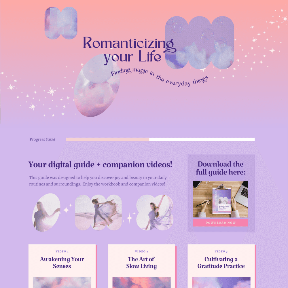
See it in action:
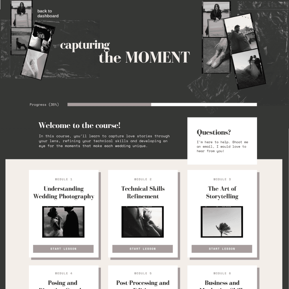
See it in action:


Download our Course Design Kit for Canva
Download our Course Design Kit for Canva
Design your Teachery digital products and online courses in a fraction of the time with this Canva Kit! Comes with template courses for you to customize, color palettes, font pairings, alternative card layouts and example courses to inspire you!


Free Canva Template Includes:
Course Skeleton
Alternative Card Designs
Color Palettes
Font Pairings
15+ Example Courses
© 2013 - Present | Teachery Inc. All rights reserved.
© 2013 - Present | Teachery Inc. All rights reserved.
© 2013 - Present | Teachery Inc.
All rights reserved.
